

Gnumeric · Charts · Beginner
Make an XY Scatter Plot with Paired Values in Gnumeric
Assign separate X and Y ranges, check numeric spacing, and add axis labels and sensible bounds to a Gnumeric scatter plot.
Paired XY chart, bounds, labels and change test verified in Gnumeric 1.12.57 / GOffice 0.10.57 · Editorial standards
Choose an XY scatter plot, then explicitly assign one numeric range to X and an equally sized range to Y. A line chart with category spacing can make irregular measurement times look evenly spaced.
Scope and sample
The chart below was tested on 2026-10-16 in Gnumeric 1.12.57 with GOffice 0.10.57, Debian 13.6 Linux, English interface/C locale. The 1.12 graph manual, also shipped with the reviewed 1.12.62 source, was used as background. Its older tab labels differ from this tested editor; the steps below use the observed controls. Saved-file reopening, chart Properties reopening and other formats were not tested.
Download paired values (CSV) and import into A1:B5:
| Time_min | Distance_m |
|---|---|
| 0 | 0 |
| 1 | 3 |
| 4 | 12 |
| 10 | 30 |
Both columns contain numbers. The four pairs follow distance = 3 × time. Their horizontal gaps are 1, 3 and 6, which makes an incorrect category axis easy to spot. CSV contains the data, not a prebuilt chart.
Assign the series explicitly
- Select A1:B5 and choose Insert → Chart to open the Graph Guru. Preselection is convenient, but do not assume its inferred series is correct.
- Choose the XY scatter type and a style with markers and no connecting lines. Use the subtype preview/description to distinguish markers from a line-only variant. Choose Forward to reach the component editor.
- Expand the chart and plot in the component tree. Select its Series. If there is no series, select the plot and use Add to add one.
- In the series data properties, set X to A2:A5 and Y to B2:B5, using the range selector so the correct sheet name is included. Do not include the heading row. Both ranges must contain four observations in matching row order.
- Give the series a name such as
Distance observations. Remove only unintended extra series in this new chart; two series each plotted against row numbers are not the same as one paired XY series.
Configure axes and titles
- Select the horizontal axis in the component tree. Open its Scale tab and the Bounds section. Clear the Automatic checkboxes beside Minimum, Maximum and Major ticks, then enter 0, 10 and 2, respectively. Keep Mapping → Type: Linear for this practice dataset.
- Select the vertical axis and repeat the Scale → Bounds setup: clear those three Automatic checkboxes, then set minimum 0, maximum 30, with a major tick interval of 10. These fixed limits are an example, not settings to reuse blindly with other data.
- Select each axis and use Add → Label for that axis. Select the new label and enter
Time (min)orDistance (m)in Details → Text. In this editor, label text uses Details; series X/Y assignments use Data. The older manual’s Data-tab wording for labels does not match the tested editor. - Select the chart and use Add → Title, entering
Distance over timethrough Details → Text. Then Insert the chart and place it in an empty worksheet area. The manual describes right-click Properties for later changes; that reopen path was not exercised in this test.
If your installed chart editor has different limit or label controls, use the component properties rather than a menu path copied from another spreadsheet program.
Verify the geometry
Expect four points at (0,0), (1,3), (4,12), (10,30). The point at time 1 is one tenth of the horizontal plotting span from zero; the point at 4 is four tenths across. The gaps must not all be equal.
The points form a straight increasing pattern, but that alone does not prove the X range is correct. Inspect axis values and pair assignments. =COUNT(A2:A5) and =COUNT(B2:B5) should both return 4. As a reversible test, change B4 from 12 to 15: only the point with X=4 should move vertically. Restore it afterward. In the native test both counts were 4, and changing B4 to 15 moved only the X=4 point vertically; B4 was then restored to 12.
Actual chart setup and result
Select a screenshot to open the full-size image.
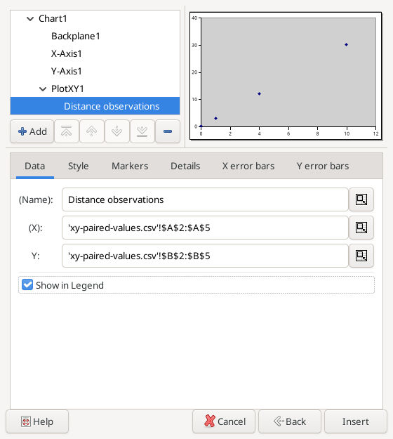
Actual X/Y series assignment, captured 2026-10-16.
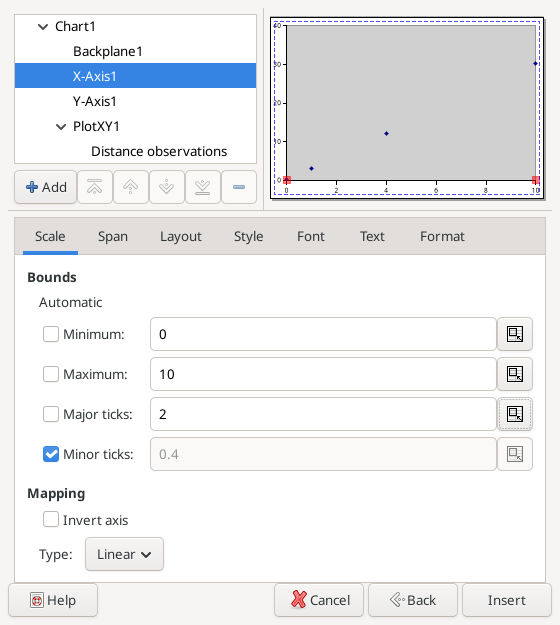
The tested editor uses Scale → Bounds. Minimum, Maximum and Major ticks are set to 0, 10 and 2.
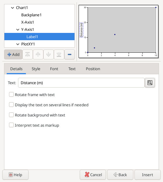
Axis-label text uses Details → Text in GOffice 0.10.57.
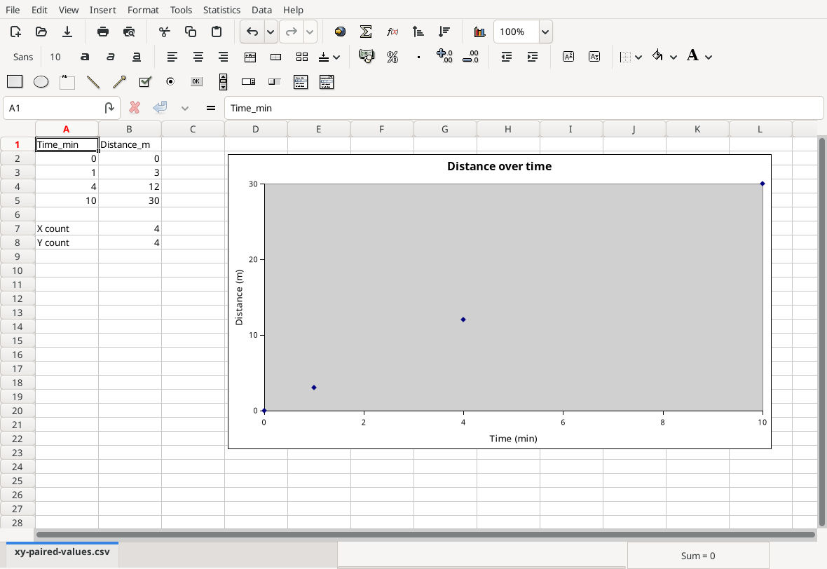
Actual restored four-point chart and COUNT results. The X intervals are unequal as required.
Download the saved native chart workbook. Native saving was verified. Appended rows, logarithmic mapping, missing-data cases and reopening the saved chart were not tested.
Troubleshooting
- X labels look like row positions: reselect the series and set its X range explicitly; confirm XY rather than Line.
- Missing or misplaced points: inspect numeric types, blanks, errors and differing range lengths. Do not replace a genuinely missing measurement with zero merely to make a chart draw.
- Pairs no longer match: undo any sort applied to only one column. Sort the paired table together if sorting is needed.
- New data disappear: expand both series ranges and review fixed bounds; an added point beyond 10 or 30 can be clipped.
- Unwanted zigzag lines: use marker-only style, or deliberately sort whole pairs by X before drawing connecting lines when that interpretation is appropriate.
Save a Gnumeric workbook to preserve the chart. See COUNT for the numeric checks.
Official references
- The Graph Guru.
- Plot types: XY Scatterplots.
- Graph element properties, especially dual X/Y series, continuous axes and labels.