

LibreOffice Calc · Charts and visualization · Intermediate
Use Real Dates on a Calc XY Scatter Chart’s X-Axis
Create a Calc XY scatter chart with numeric date X-values, format the axis as dates, and verify that irregular time gaps have proportional spacing.
Worked example tested in LibreOffice Calc 26.8.1.1 · Editorial standards
Use XY (Scatter) with real numeric dates as the X-Values and measurements as the Y-Values. Then format the horizontal axis’s numbers as dates. The important check is spacing: a ten-day gap must be ten times as wide as a one-day gap on a linear axis.
Typing date-looking labels into a category axis does not establish that the chart uses elapsed time. For this task, assign the X range explicitly rather than trusting the wizard’s first guess.
1. Create an irregularly spaced example
Use an ODS working copy in desktop Calc. These directions are based on LibreOffice 26.8 Help, the standard menu bar and English function names. The example uses semicolons; adapt the argument separator if your Formula options differ.
Rename the sheet Measurements. Enter Date in A1 and Reading in B1, then type:
| Row | A: Date formula | B: Reading |
|---|---|---|
| 2 | =DATE(2026;10;1) |
12 |
| 3 | =DATE(2026;10;2) |
15 |
| 4 | =DATE(2026;10;12) |
14 |
| 5 | =DATE(2026;10;22) |
18 |
Using DATE creates numeric dates rather than locale-sensitive date strings. Format A2:A5 as Date with a readable year-month-day display. In C2 enter =ISNUMBER(A2) and fill down to C5: expect four TRUE results. Check B2:B5 with ISNUMBER too if they came from an import.
Independently check the gaps: =A3-A2, =A4-A3 and =A5-A4 should give 1, 10 and 10 when their cells are formatted as Number. Leave these checks outside the chart’s data range. The DATE documentation explains date construction; Calculating With Dates and Times explains why a date difference can initially need a numeric display format.
2. Build an XY chart and inspect its data roles
- Select A1:B5 and choose Insert → Chart.
- Choose XY (Scatter), initially Points Only. Using points avoids implying measurements between observations.
- On Data Range, use data series in columns and the first row as labels. The first data column is intended to supply X-values, but verify the explicit assignment in the next step: in the tested Calc 26.8.1.1 setup, the initial X-Values role was empty while the dates appeared under Data labels. Assigning date labels alone does not bind the X-values. See Chart Wizard: Data Range.
- Open the Data Series step. Keep one series for Reading and inspect each role:
| Role | Range |
|---|---|
| Name | $Measurements.$B$1 |
| X-Values | $Measurements.$A$2:$A$5 |
| Y-Values | $Measurements.$B$2:$B$5 |
- Correct any role that includes a header, points to the wrong column or contains a different number of rows. The Name is one header cell; the numeric X and Y ranges each contain four values.
- Give the chart a meaningful title such as Reading over time, with Date and Reading as axis titles, and finish.
The Data Series documentation describes editing each data role independently and excluding header cells from value ranges. For an existing chart, double-click it to enter chart-edit mode, then use Format → Data Ranges to inspect the same assignments.
Select a screenshot to open the full-size image.
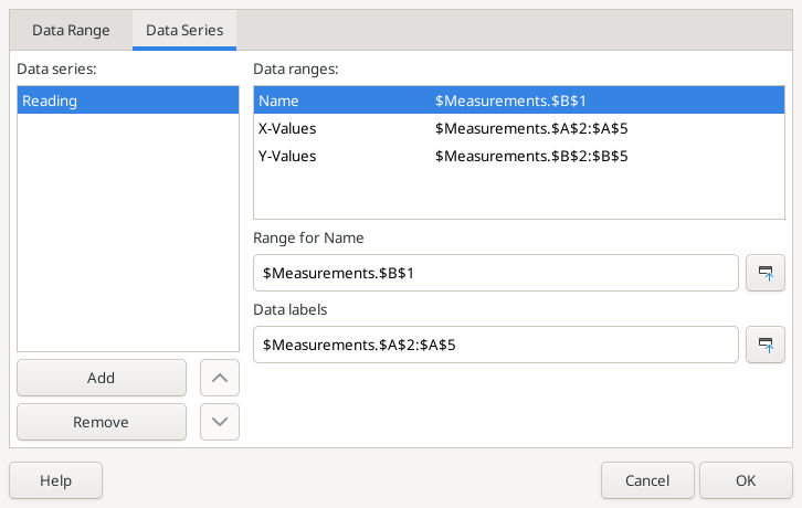
Native Calc 26.8.1.1 retained the explicitly assigned Name, X-Values and Y-Values after saving and reopening.
Checkpoint: there should be four points, with readings 12, 15, 14 and 18 paired with the four dates. If you see two unrelated series named Date and Reading, fix the series roles before touching axis labels.
3. Display date labels on the numeric horizontal axis
- Double-click the chart to enter chart-edit mode.
- Choose Format → Axis → X Axis, or select the horizontal axis and open its formatting dialog.
- On Numbers, clear Source format if it prevents choosing your own format.
- Choose the Date category and a readable date format. For an English-locale custom format,
YYYY-MM-DDis unambiguous. After clearing Source format, enter the code, press Tab and check that the preview shows a date before confirming. Use the format preview to check the result in other locales. - Confirm and inspect the horizontal tick labels. If serial numbers remain, reopen the dialog and verify the committed number format; the visible chart is the final check.
The axis is still numeric: the date format changes its labels, not the X-values. LibreOffice documents the axis dialog under Axes and the source-format control under Numbers.
A numeric XY axis does not require a separate Date axis type selector. Do not switch to a category chart simply because you cannot find that selector. Some other chart axes offer a date-type setting; this workflow instead plots date serials as continuous X-values.
4. Verify elapsed-time spacing and readable ticks
The first two points, October 1 and 2, should be close together. The next gaps, October 2 to 12 and October 12 to 22, should be equally wide and each about ten times the first gap.
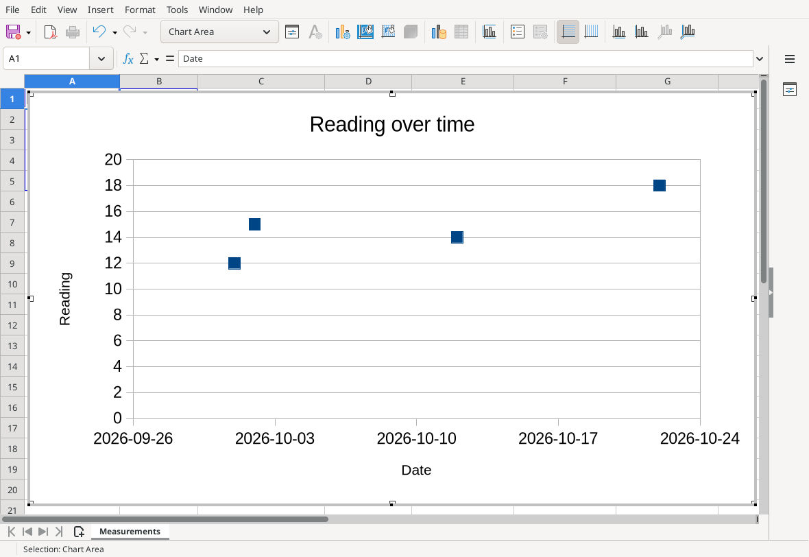
The numeric date axis shows weekly ticks; observations keep their actual one-day and ten-day spacing.
If you need predictable tick spacing, reopen the X Axis dialog and its Scale tab:
- Keep a normal linear scale; do not enable logarithmic scaling.
- Leave minimum and maximum automatic initially.
- Clear Automatic for Major interval, and try 7 for weekly ticks. On a numeric date axis, one unit represents one day, so seven units represents seven days.
- Widen the chart or choose shorter labels if ticks overlap. A tick need not coincide with every observation date.
Manual bounds can accidentally hide observations. If you set them, obtain the boundary serials from date cells in the same workbook rather than copying a serial from an unrelated file. Scale documents automatic limits, major intervals and the difference between numeric scaling and the date-type options available on some axes.
As a response test, temporarily change A3 to =DATE(2026;10;6). The second point should move right to five days after the first, while its reading remains 15. Restore October 2. This tests the actual X binding rather than merely attractive labels.
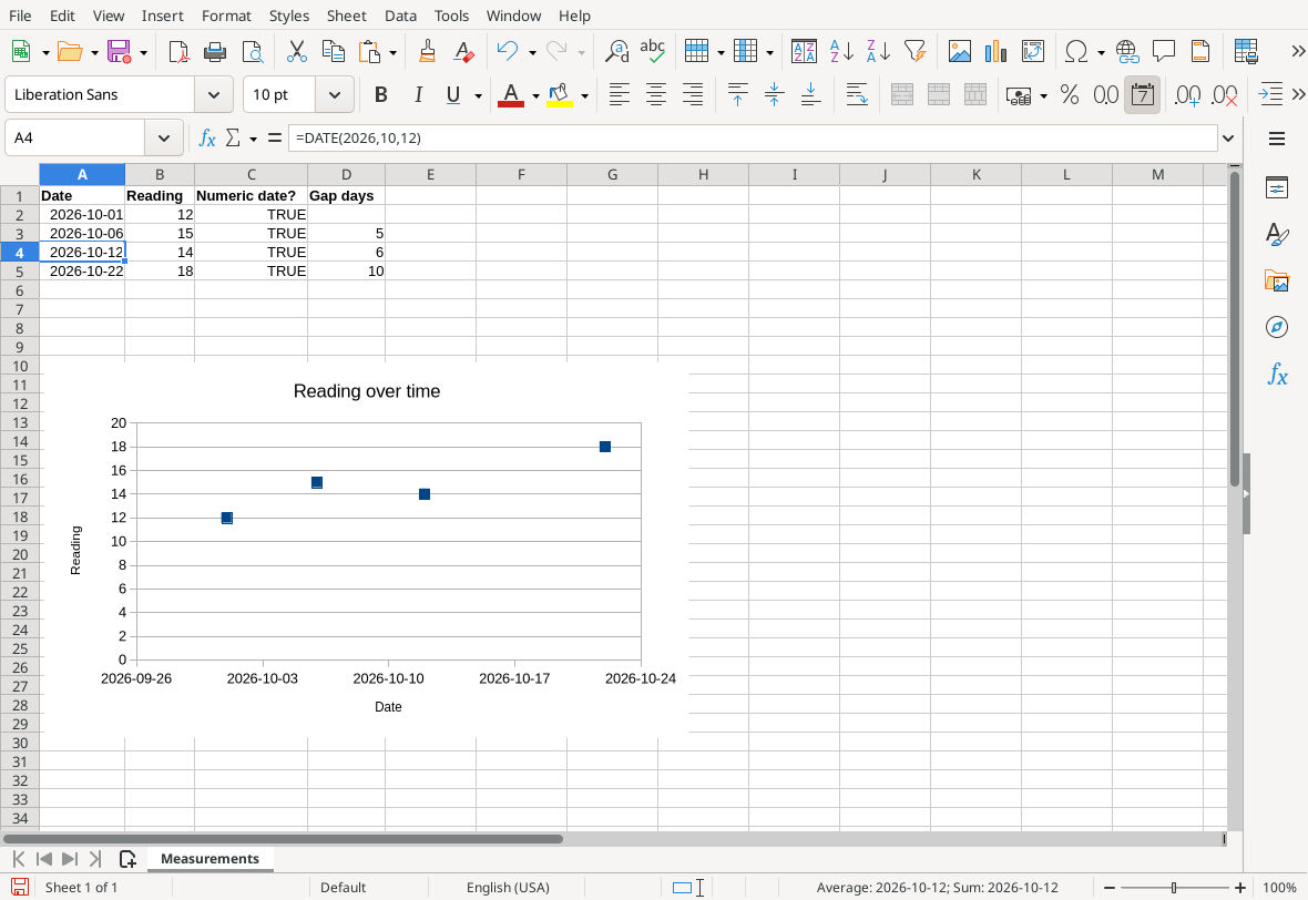
The response test changes only the second point’s X position. The original October 2 date was restored before saving.
If you want lines between observations
Choose Points and Lines only when connecting measurements is meaningful. Sort the records chronologically, or use the chart’s Sort by X Values option where offered. Sorting the chart does not sort the source table. Avoid smoothed curves unless the interpolation is justified by your data. The variants and drawing order are documented in Chart Type XY.
Common problems
- Labels are large serial numbers: apply a Date format to the X axis, not just the source cells, or enable Source format with correctly formatted source dates.
- The X axis is 1, 2, 3, 4: recheck the X-Values range and numeric date tests. Do not cover an incorrect binding with custom date-looking text.
- All dates are equally spaced: verify XY chart type and inspect the one-day/ten-day gap test. A text-category chart can make unequal time intervals look identical.
- Date text fails ISNUMBER: convert it deliberately first. DATEVALUE can parse suitable date text, but formatting alone is insufficient; ambiguous day/month order needs a known source convention.
- Several points overlap: duplicate dates legitimately share an X position. If timestamps differ within a day, use genuine numeric date-times and a format that includes the time.
- A line doubles back: check record order and the chart’s X sorting. A line follows its series order unless sorted.
- Dates shift after copying from another document: verify matching date bases before comparing serials; see Move or Copy a Sheet.
Verification: the native XY Points Only chart, explicit Name/X/Y roles, date-number format, linear scale with seven-day major intervals, 1/10/10-day spacing, and temporary five-day movement of the second point were tested in LibreOffice Calc 26.8.1.1 on Linux (English interface, English USA locale) on 16 October 2026. After restoring October 2, actual save/close/reopen retained the source dates, chart spacing and all three role addresses. The screenshots are unchanged native captures; date gaps were also independently checked. Alternate locales, Excel interchange, category-chart comparisons, text-date conversion, line/smoothing variants, multiple series, secondary axes, logarithmic scaling and manual-bound experiments were not tested; those alternatives and cautions remain documentation-based.